When it comes to design, few things can set the mood of a room more than its hue. Picking out the perfect paint color can be anxiety-inducing—from compiling color swatches to painting test strips, getting the perfect paint color down is really an art form. The good news? Paint isn’t permanent, and mixing it up can be a great way to transform a room without a lot of effort.
If you’re looking for a bold new paint idea this year, here are some of the biggest paint trends of 2019 from designers and paint manufacturers alike.
01White Is Still In
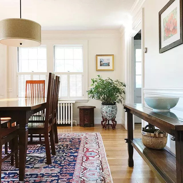
Photo: Trim Design Co
White paint may seem like a timeless choice, but according to Annabel Joy from Trim Design Co, white-washed rooms aren’t going anywhere this year.
“[We] recommend homeowners abandon the cool grays that have dominated for the past several years and embrace the new neutrals, which are warmer and more complex,” says Joy.
This lovely dining room is painted with Benjamin Moore Navajo White, which Joy says is “the perfect backdrop for the primitive decor and old world farmhouse trends we’re seeing the return of this year, especially in kitchens.”
This year, don’t shy away from neutrals, but go for warm tones that give a room dimension and depth.
02Benjamin Moore’s Hale Navy
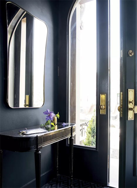
Photo: Benjamin Moore
This year, Benjamin Moore introduced 15 hues that they predict will rule 2019. One of our favorites? Benjamin Moore’s Hale Navy, as seen in this stunning entryway. Dark, moody walls have been on the rise over the past few months, and we don’t see the momentum stopping any time soon. Sure, we love bright white walls that open up a space, but deep, rich colors can add endless personality.
This dark navy blue creates a stately, chic look perfect for powder rooms, accent walls or entryways.
03Benjamin Moore’s Beau Green
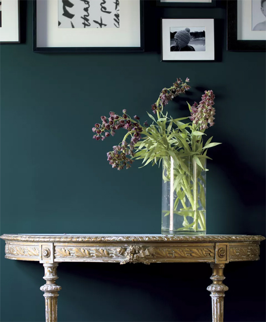
Photo: Benjamin Moore
We expect to see Benjamin Moore’s Beau Green everywhere this year. Similar to the deep navy, this rich hunter green is perfect for lending depth to your space. Green adds a lushness that packs a punch and makes a statement.
We love the idea of Beau Green in a traditional dining room, den or cozy office. Add a gallery wall with colors that play well with deep green walls, and you’ll create some sophisticated visual interest.
04Benjamin Moore’s Head Over Heels
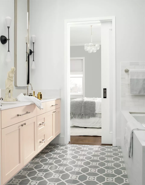
Photo: Benjamin Moore
This enviable master bathroom features three of Benjamin Moore’s 2019 color trends: Decorator’s White (bathroom walls), Head Over Heels (bathroom vanity) and Metropolitan (far wall). This year, we predict we’ll see a whole lot more soft pinks (like Head Over Heels) than ever before. No longer a color reserved for nurseries, pink is now sophisticated and modern.
The soft pink vanity shown here offers a pop of color without sacrificing a clean, neutral look. Consider painting a master bedroom or laundry room a soft pink that opens up the room without feeling overly girly.
05Crisp White Is Still In
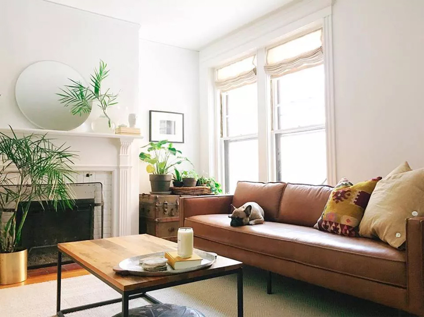
Photo: Trim Design Co.
According to Annabel Joy from Trim Design Co, you don’t have to totally abandon the clean stark whites that have been popular the last few years. This living room is painted with Benjamin Moore’s Super White, which instantly brightens up the space.
If you’re considering a cool white, look for rooms that could use a little more natural light. A cool white helps reflect what light you already have and creates the illusion of a spacious, open room.
06Valspar Blushing Bride
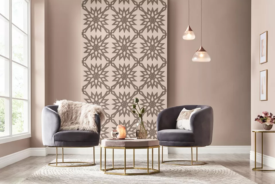
Photo: Valspar
Like Benjamin Moore, Valspar also predicts pink will be big in 2019. One of their 12 color trends, Valspar’s Blushing Bride is a modern choice for any home. A little pinker and a little bolder than Benjamin Moore’s Head Over Heels, Blushing Bride is a chic hue we can’t wait to see in every room this year.
Soft pinks are warm and calming—consider trying this color in a sitting room (as seen above) or a guest bedroom.
07Valspar Seattle Haze
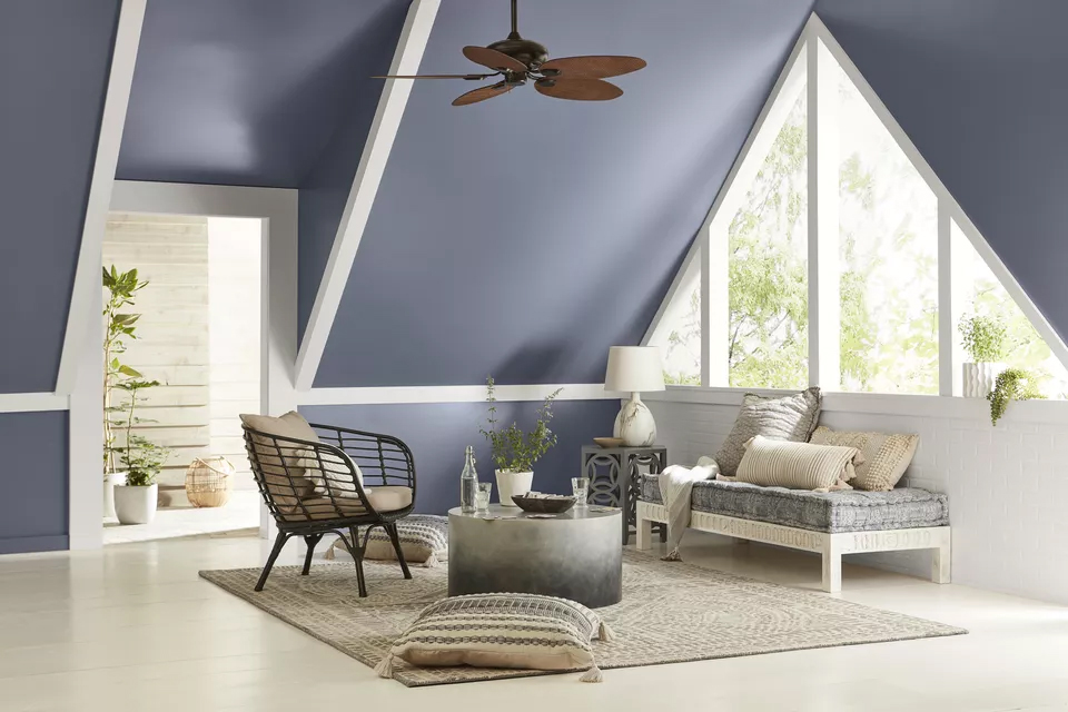
Photo: Valspar
If you’re more into gray than pink, you’ll love Valspar’s Seattle Haze. This rich slate blue-gray color is deep and nuanced. The subtle purple tone adds a depth without overpowering the space. Here, the vibrant paint color creates a soothing, grounded feel in a sitting room.
This year, consider picking grays that have more tones of blues and purples to add even more richness to your design scheme.
08Valspar Orange Slice
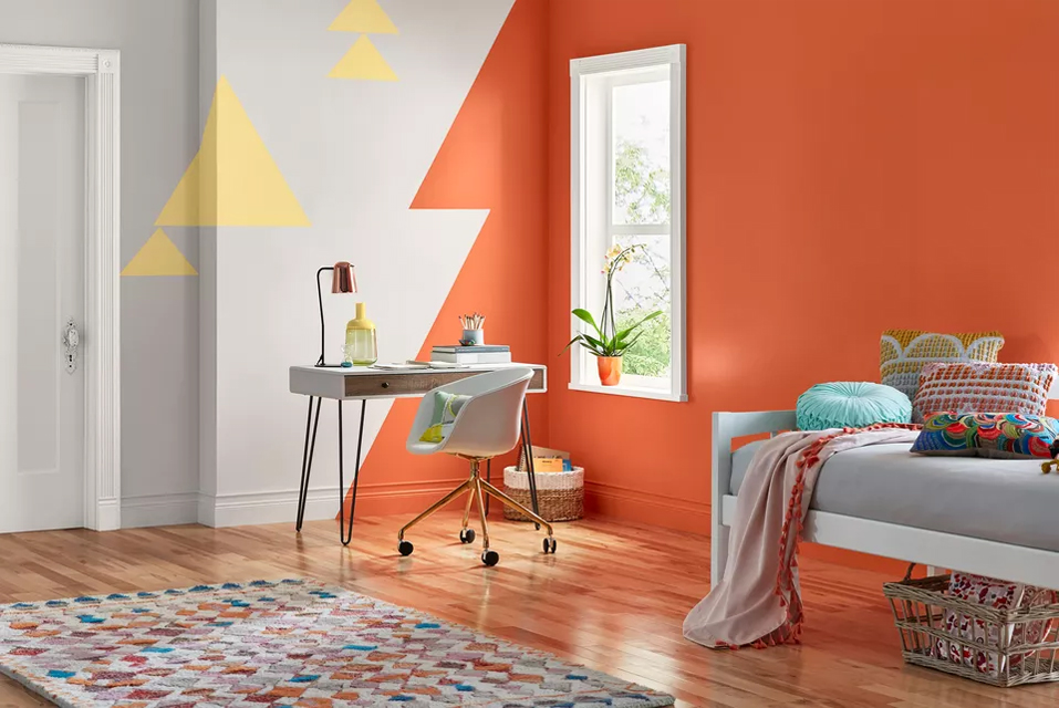
Photo: Valspar
Finally, another favorite on the Valspar trend list: Orange Slice. This year is all about making a statement, and nothing says “look at me” more than a splash of bright orange paint. Whether it’s in a kid’s room or a living room, a bold orange tone takes center stage in any room. Don’t be afraid to experiment with more adventurous bright colors this year—after all, you can always paint over it next year.
09PPG 2019 Color of the Year, Night Watch
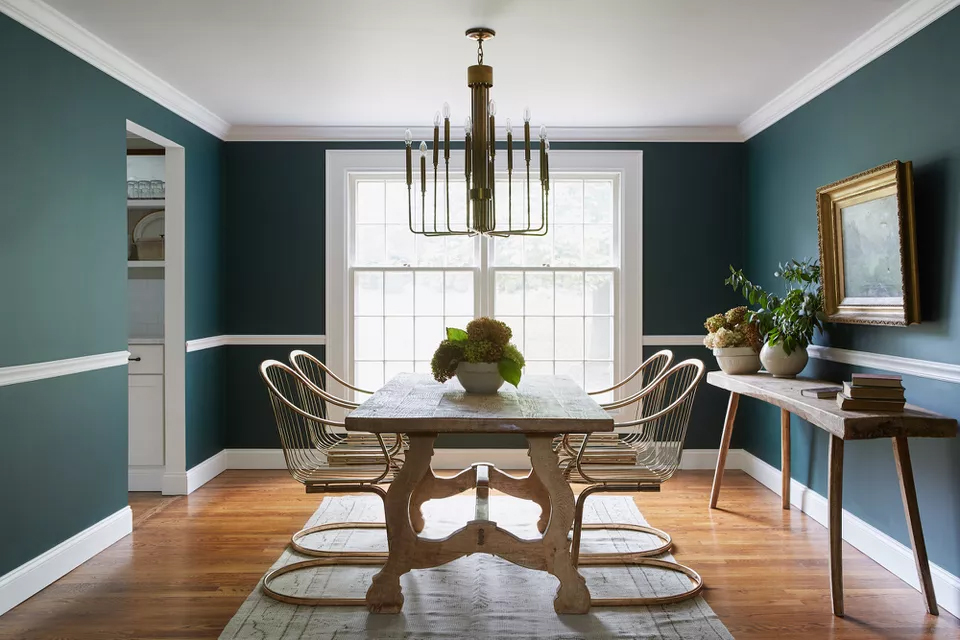
Photo: Leanne Ford for PPG, shot by Reid Rolls
PPG announced Night Watch as their 2019 color of the year. Similar to many other brands’ picks, Night Watch is a rich, deep green that is in line with what most experts predict to see in the months ahead. This dining room designed by Leanne Ford for PPG proves just how versatile and functional a strong, moody color can be. Many typically shy away from using dark colors in smaller spaces, but the mossy green adds an element of surprise and interest without requiring a lot of accent pieces.
10Sherwin-Williams Cavern Clay
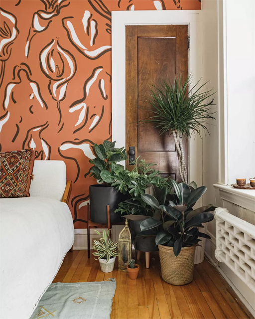
Photo: Wit & Delight
Sherwin-Williams picked the mid-century modern-inspired Cavern Clay as its top trend this year. In this bedroom from Wit & Delight, you can see just how much character this earthy hue adds to any space. Plus, the handpainted mural creates a lot of visual interest and personality in a smaller and more limited room.
Consider using this warm, outdoor-inspired hue in dining rooms, bedrooms, and sunrooms.
11Behr Blueprint
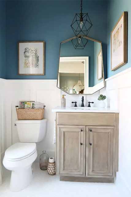
Photo: Porch Day Dreamer
A nod to rich denim blues, Behr selected Blueprint as its top color this year. This not-too-light, not-too-dark blue is the perfect way to add a splash of color that still feels adult and modern. Here, blogger Porch Day Dreamer used Blueprint to create a fun-yet-sophisticated bathroom look. The color plays well with the neutral elements in the room while still feeling dressed up.
12Behr Blueprint
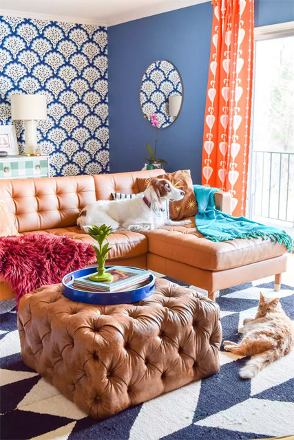
Photo: PMQ for TWO
Another use of Behr Blueprint shows just how versatile this medium blue hue really is. In this eccentric living room from PMQ for TWO, Blueprint is just one of many bold colors that blend together to create a load of personality. This year, don’t be afraid to be a little adventurous when it comes to color—mixing and matching bold hues can result in a room that feels unique and personalized.
13Pantone’s Living Coral
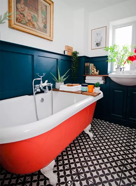
Photo: Instagram / oxfordone
This year, Pantone picked the playful Living Coral as its color of the year. Though some may see coral as a difficult color to decorate with, it can actually be a versatile and lively addition to nearly any room in your house. Here, Instagram user oxfordone used a bold coral to update a vintage clawfoot tub. The result is a bathroom that’s bright, fun and inviting.
Article courtesy of The Spruce | By Ashley Knierim


